PT Global Artha Pratama was established in 2008 as an expert in bridging international bulk material handling and processing to the Indonesian market. Starting with a partnership with NEU-JKF, a French company based in Lille, a specialist in air filtration, we have been fast developing our activities by expanding our partnership through other French and European companies in the industrial sector.
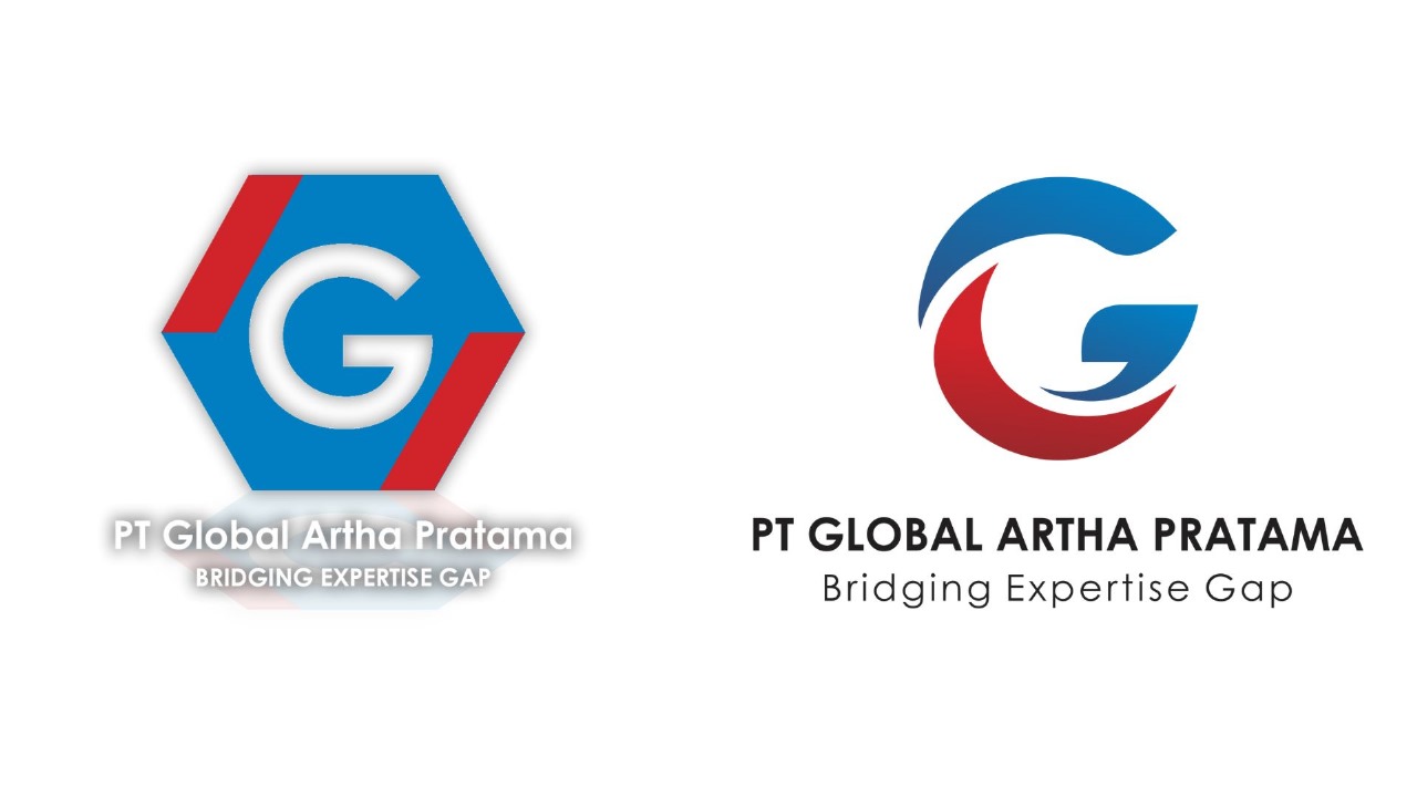
After 15 years of activities, on this Indonesian Independence Day, we proudly present our new logo to our commitment to evolution and embracing new challenges. Through this post, we invite you to discover the spirit of this new logo:
Letter G
The letter G not only represents the company name “Global” but also can stand for “Gateway” and “Guide,” which are aligned with the idea of being a bridge.
Three Shapes
Using three shapes to form the letter G suggests a triadic relationship: (1) international expertise, (2) our company, and (3) national industry. This arrangement underscores the idea of harmoniously linking these elements.
Colors
🔴 Red is often associated with energy, strength, passion, and determination. It represents our vibrant and dynamic approach to bridging the gap.
🔵 Blue, on the other hand, symbolizes stability, trustworthiness, and professionalism. It reflects the secure foundation upon which the bridge is built.
⚪ White as the background serves as a canvas that emphasizes the clarity and transparency of our mission.
Overall, our new logo encapsulates the philosophy of being a bridge and closing the gap between international expertise and the Indonesian market. Moreover, the new logo brings us a new spirit to provide better work and service for our partners and customers.


